

Elevating the Visual Language of Private Bank Email
Defining a refined visual direction for Private Bank email communications
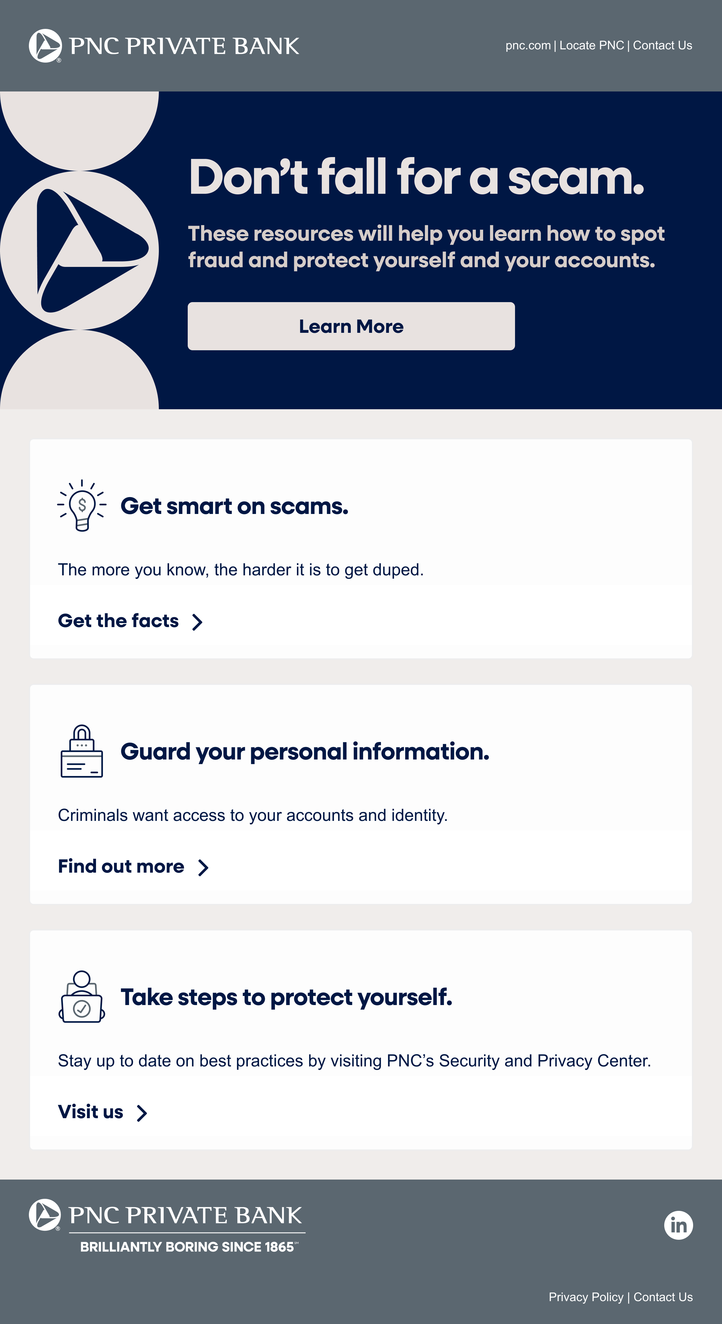
Private Bank email communications had evolved over time within the same modular framework, but individual campaigns had gradually developed slight variations in visual treatment. While the emails felt related, the overall design direction lacked cohesion when viewed together.
This exploration proposed a refined visual direction for Private Bank communications, maintaining the existing modular system while elevating the overall look and feel. Using five existing email campaigns as examples, the updated designs demonstrate how a more unified and sophisticated visual language can scale across a range of Private Bank content.
The Credits
Client: PNC Bank
Agency: RAPP Worldwide
Role: Art Director
Creative Direction: Terje Vist
Creative Engineer: Georgie Parker
The Challenge
Private Bank email communications had gradually evolved over time within the same modular framework. While each campaign followed the system, individual emails had developed slight variations in visual treatment.
When viewed together, the communications felt related but lacked a clearly unified design direction.
So how could the design be refined to create a more cohesive and elevated visual language for Private Bank communications?
The Before

Design Approach
Rather than redesigning the system entirely, the goal was to refine the visual language within the existing modular framework. The updated direction maintains the familiar structure of Private Bank emails while introducing more cohesive and elevated design treatments.
Modules were rebuilt using content from previous campaigns, allowing recurring communications to easily adopt the updated look and feel. Additional content-swap modules were also created to support different types of messaging while maintaining a consistent visual system.
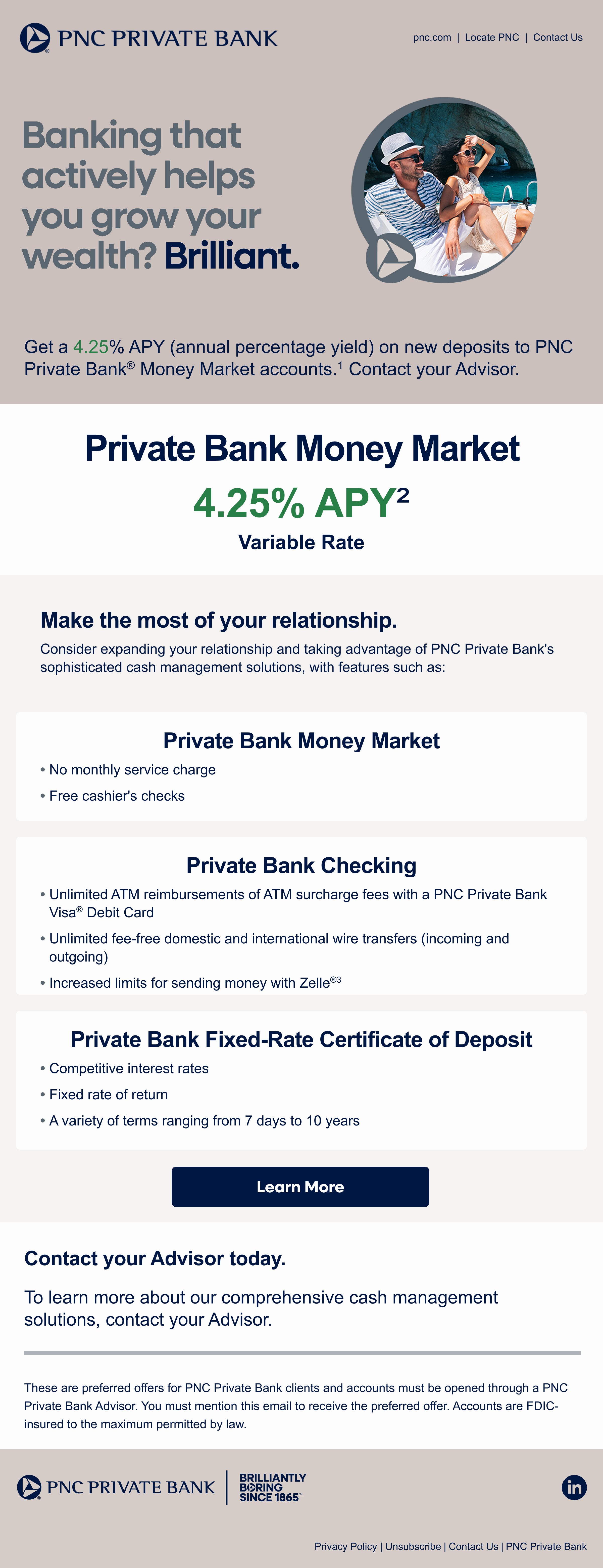
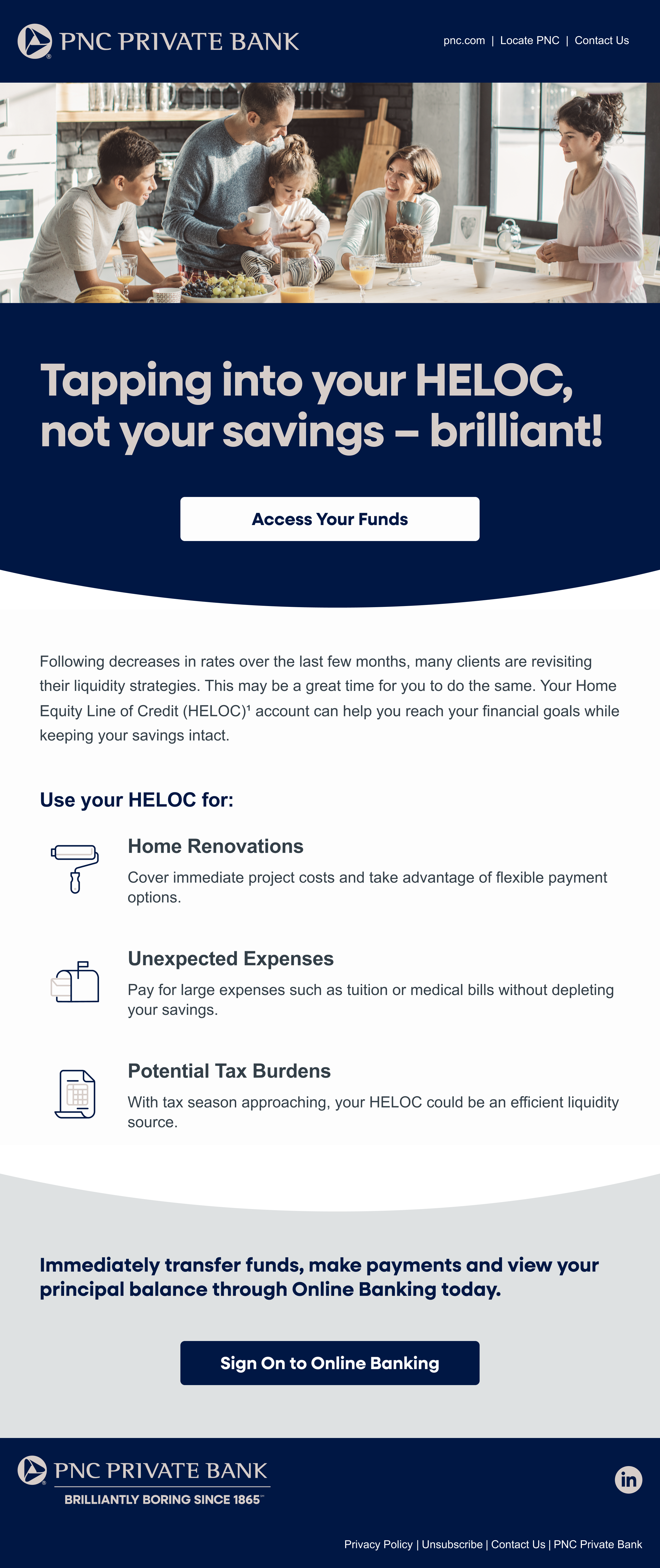
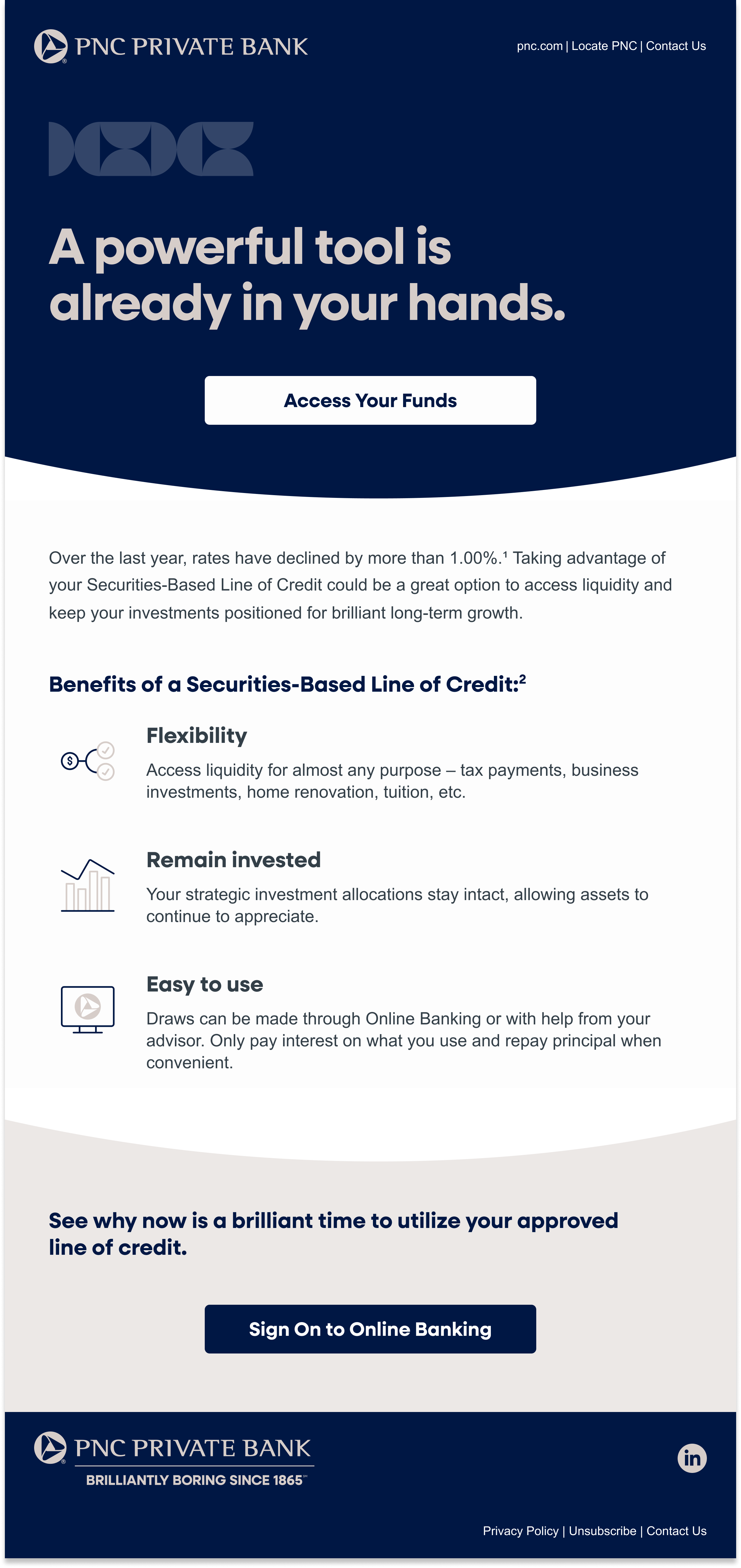
Key refinements focused on color hierarchy, graphic treatments, and imagery usage. By shifting the primary emphasis from Sand to Azurite and refining how shapes interact with imagery and text, the updated designs introduce a more sophisticated visual tone appropriate for a mass affluent audience.
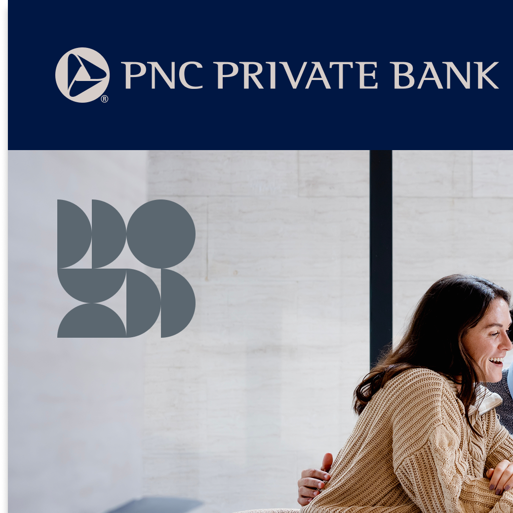
The After


The Execution
The refined direction focused on subtle but intentional adjustments to how existing design elements were applied across Private Bank communications.
Color hierarchy was updated by shifting emphasis from Sand to Azurite, creating a stronger visual anchor throughout the emails. Graphic shapes were softened and used more deliberately, including monochromatic treatments that create a more refined tone while still maintaining the brand’s recognizable visual language.
Imagery treatments were also refined through more intentional cropping and the introduction of shape interactions within and around images. These adjustments help guide the viewer’s eye through the layout while reinforcing a cohesive visual rhythm across modules.
Key Design Refinements
-
Reduced Shape Contrast
Monochromatic shapes create a more refined and elevated visual tone.
-
Graphic Shapes Within Imagery
Corner shape elements ground imagery and introduce subtle brand variation.
-

Pattern Overlays on Imagery
Low-opacity shape clusters overlap images to guide the eye down the page.
-

Intentional Image Cropping
Circle crops push slightly beyond the midpoint to introduce visual tension.
-

Shape-Anchored Messaging
Solid shapes frame content and draw attention to key modules.
-

Color Hierarchy Shift
Azurite becomes the primary visual anchor, replacing Sand.
The Impact
The proposed visual direction was presented to senior marketing leadership, including the SVP and Head of Marketing for Wealth Management and Corporate & Institutional Bank.
The refined approach was approved and adopted as the evolving visual direction for Private Bank email communications, helping ensure future campaigns maintain a more cohesive and elevated design language.
Client: PNC Bank
Agency: RAPP Worldwide
Role: Art Director
Creative Direction: Terje Vist
Creative Engineer: Georgie Parker
Account Management: Donna Bellamy, Ngoan Nguyen
Project Management: Emily Peek
Client: PNC Bank Agency: RAPP Worldwide Role: Art Director Creative Direction: Terje Vist Creative Engineer: Georgie Parker Account Management: Donna Bellamy, Ngoan Nguyen Project Management: Emily Peek